You improve your PrestaShop store’s conversion rate by removing friction, clarifying value, and nudging buyers at the right moment.
Most PrestaShop stores do not have a traffic problem. They have a decision problem.
Visitors land on product pages, scroll a bit, hesitate, and leave.
I have seen this pattern across small and mid-sized stores.
This guide focuses on practical conversion fixes you can apply inside PrestaShop without redesigning your whole store or changing themes.
1. Optimize product pages
You increase conversions when product pages answer buying questions fast.
Your product page carries the highest purchase intent. Minor improvements here usually outperform homepage or blog changes.
Use high-quality, fast-loading product images

High-quality images increase buyer confidence and reduce hesitation.
Visitors judge product quality before they read a single word. Blurry images or slow-loading galleries instantly erode trust.
Here is what works best in PrestaShop stores:
- Use 4 to 6 images per product
- Show front, back, zoomed detail, and in-use shots
- Compress images with WebP or optimized JPG
- Keep image size consistent across products
Fast-loading images support conversion signals and page speed, which also helps SEO.
Rewrite the first 100 words of product descriptions for benefits
The first 100 words should sell the outcome, not explain features.
Most PrestaShop product descriptions start with technical details. That is a mistake. Visitors scan first. They decide second.
Do this instead:
- Start with the main benefit
- Call out the problem it solves
- Explain who the product is for
Example structure:
“This product helps you achieve X by doing Y. It works best for people who want Z.”
This aligns with keyword intent and keeps users engaged above the fold.
2. Add and highlight social proof
You improve conversion rate by showing that others already trust your store.
67% more purchases happen when customer reviews are visible on websites.
Social proof reduces perceived risk. It matters even more for unknown brands and first-time visitors.
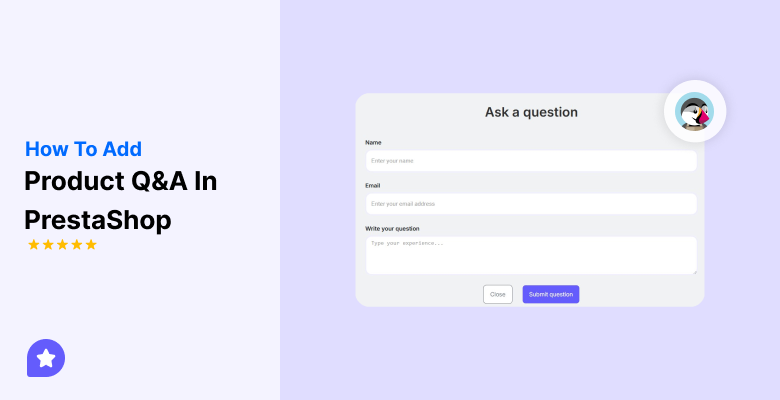
Implement a PrestaShop review module
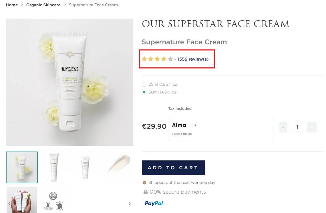
Product reviews increase trust and decision speed.
Use a native or well-supported PrestaShop review module. Focus on real customer feedback, not perfect five-star scores.
Best practices:
- Allow text reviews, not just stars
- Show review dates
- Display total review count
Reviews strengthen semantic relevance for long tail queries and increase on-page engagement.
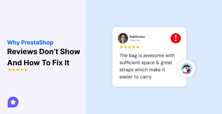
Feature the best reviews near the add to cart button
You increase conversions when proof appears at the decision point.
Do not hide reviews at the bottom of the page. Position the strongest review near the Add to Cart button.
Look for reviews that mention:
- Fast delivery
- Product quality
- Ease of use
This placement supports the conversion signal right before the click.
Enable live purchase notifications

Live purchase notifications create momentum and urgency.
These notifications display messages such as “Someone in London bought this 10 minutes ago.”
They work well for popular or impulse-driven products.
Use them carefully:
- Limit frequency
- Keep copy short
- Avoid fake data
When done right, this taps into social validation without feeling spammy.
Show stock level urgency
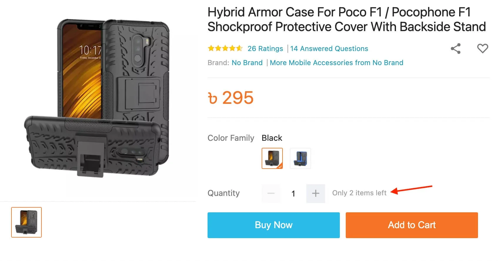
Stock level urgency pushes hesitant buyers to act.
Examples that work:
- “Only 3 left in stock”
- “Selling fast this week”
Make sure stock data is accurate. False urgency destroys trust faster than no urgency at all.


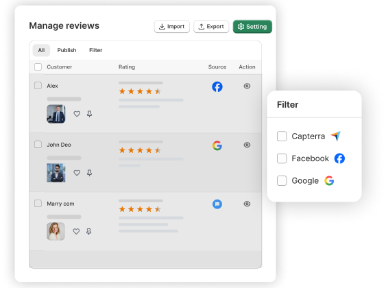
Show product reviews that boost trust
Collect reviews from email and WhatsApp, manage them easily, and display them beautifully on your PrestaShop store.
3. Improve your CTAs
You increase conversions when CTAs tell users exactly what happens next.
Generic buttons do not convert well. Clear action-driven CTAs do.
Use high contrast, action-driven Add to Cart buttons
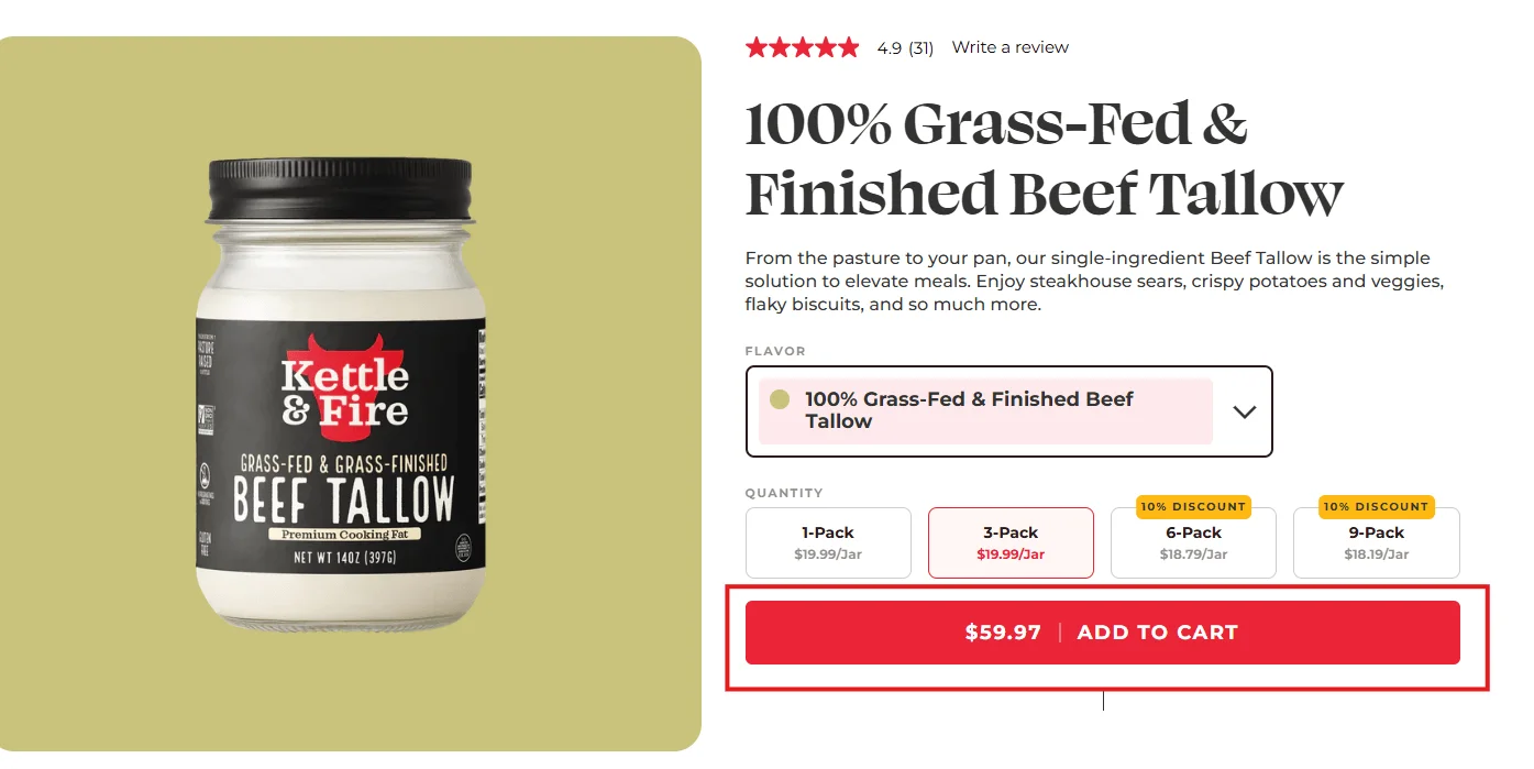
The Add to Cart button should stand out visually and verbally.
What works best:
- High contrast color against the page background
- Short action-focused text like “Add to cart” or “Buy now”
- Large enough size for mobile tapping
Avoid muted colors that blend into the design. Your CTA is not decoration. It is a decision trigger.
Repeat the CTA below the description
Repeating the CTA captures scrollers who need more information first.
Many users read the full description before deciding. If they reach the bottom and see no CTA, you lose momentum.
Add a second Add to Cart button below the description to reduce friction and scroll-back effort.
4. Reduce checkout friction
You improve conversion rate by making checkout feel fast and safe.
Checkout friction is the number one cause of abandoned carts in PrestaShop stores.
Enable guest checkout
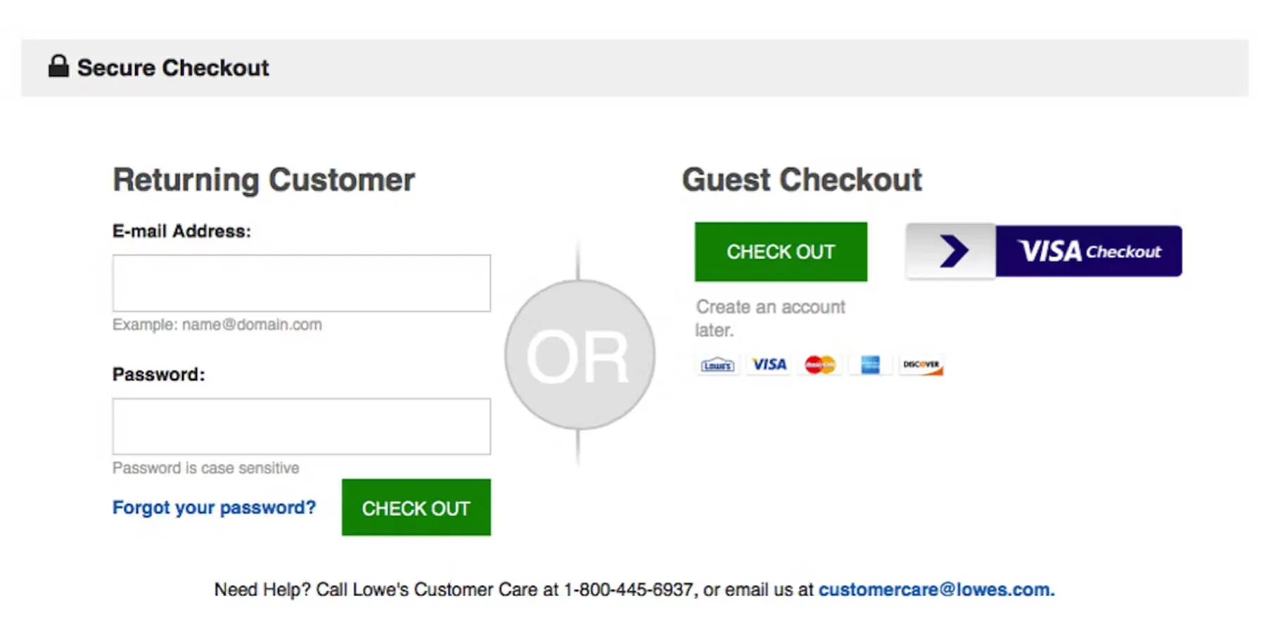
Guest checkout increases completed purchases.
Forcing account creation breaks conversion flow. Many buyers want to purchase first and decide later.
Enable guest checkout and offer account creation after the purchase.
Reduce checkout form fields
Fewer fields mean faster checkout and fewer errors.
Audit your checkout form and remove any non-essential fields.
Common fields to remove:
- Company name
- Secondary phone number
- Unnecessary address fields
This improves mobile conversion significantly.
Offer multiple payment methods

More payment options reduce drop-offs.
At minimum, support:
- Credit and debit cards
- PayPal
- Local payment methods, if relevant
Payment options align with buyer preferences and reduce hesitation at the final step.
5. Boost average order value
You increase revenue by increasing order size, not just conversion rate.
Improving average order value compounds your conversion gains.
Add simple cross-sell and upsell modules
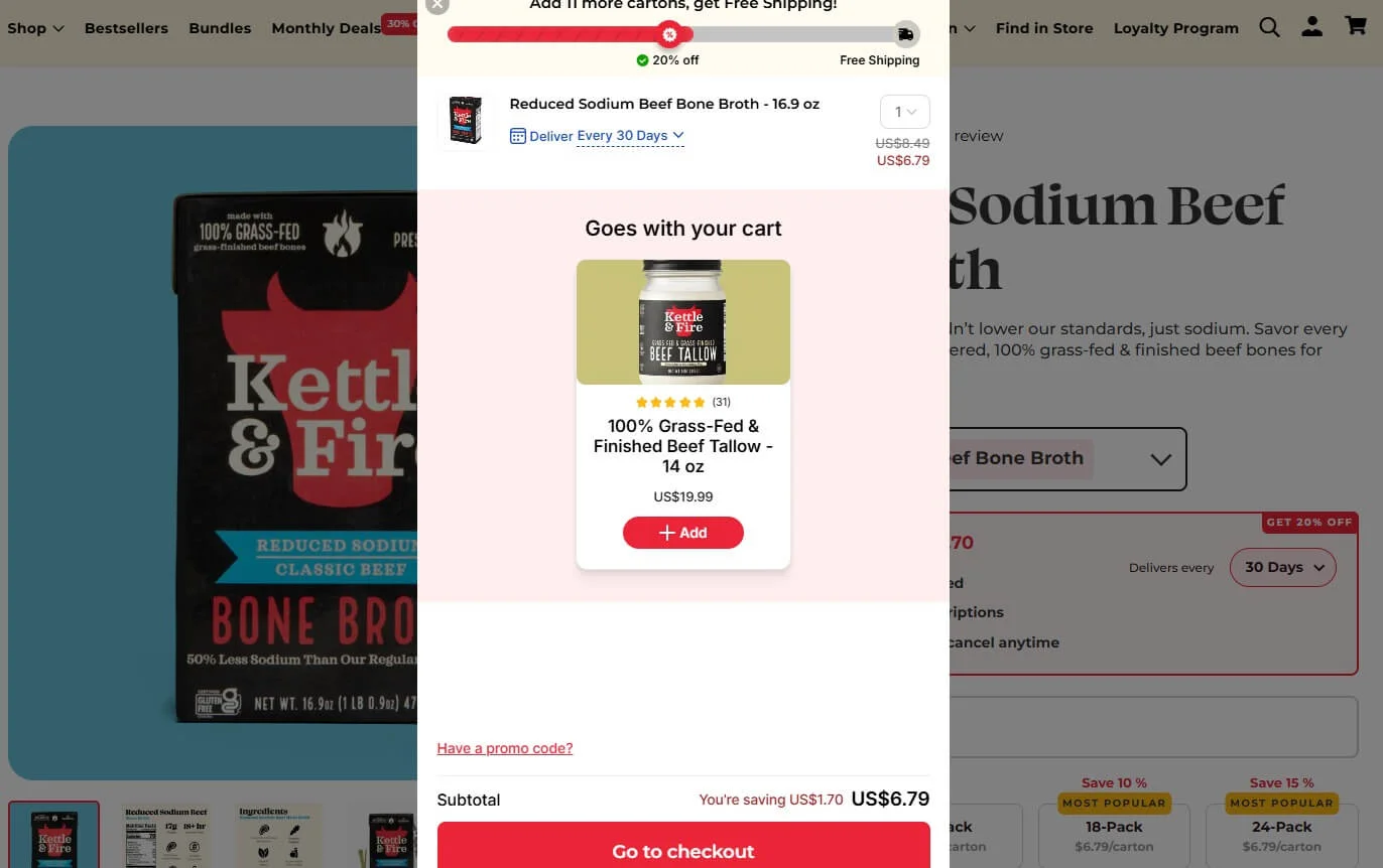
Cross-sells and upsells work best when they feel relevant.
Good examples:
- Accessories for the main product
- Frequently bought together items
- Small add-ons under a clear price point
Keep it simple. Too many suggestions create decision fatigue.
6. Recover lost sales automatically
You recover revenue by following up with buyers who abandon their carts.
Not every visitor will convert on the first visit. That is normal.
Send abandoned cart recovery emails
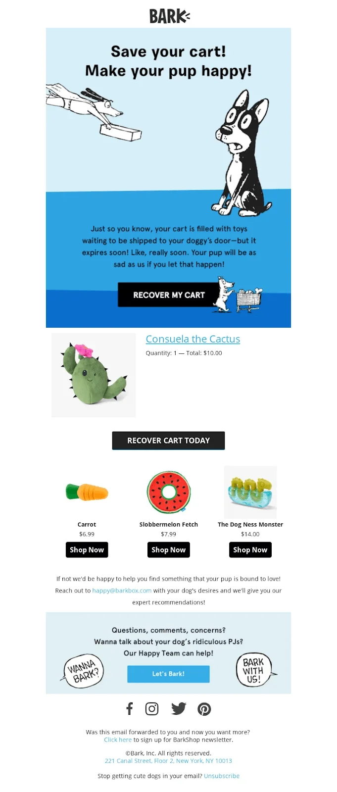
Abandoned cart emails bring buyers back when the timing is right.
Effective recovery emails include:
- Product image
- Clear reminder copy
- Direct link back to checkout
Send one email within a few hours and a second reminder within 24 hours. Do not overdo it.
This strategy works well because it targets users with high purchase intent.
Wrap up
You can improve your PrestaShop store’s conversion rate by fixing small but critical friction points.
Start with product pages. Then add social proof. Then simplify checkout. These changes compound results.
If you apply even three of these tactics, you should see measurable improvements in conversion rate, average order value, or both.
Ever looked at your analytics and thought, “Traffic is fine, but sales feel stuck”? This is where the fix usually lives.
Frequently asked questions
Conversion rate is the percentage of visitors who complete a purchase on your store.
Common reasons include slow pages, unclear product info, lack of reviews, and a complex checkout.
Product pages, checkout pages, and cart pages have the biggest impact on conversions.
Yes. Reviews, ratings, and trust badges reduce doubt and help shoppers buy faster.
Yes. Many improvements use theme settings, modules, and layout changes without code.