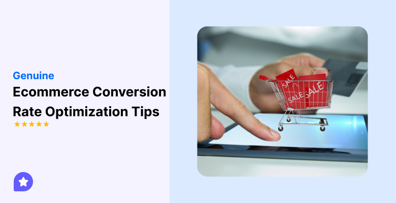
Ecommerce conversion rate optimization helps you turn more visitors into buyers.
Most online stores lose sales because pages confuse users or slow them down. Visitors leave when they do not understand the offer, do not trust the store, or find checkout difficult.
Conversion rate optimization fixes these problems. It improves clarity, trust, and flow across your store. You focus on removing friction, not adding tricks.
This guide shares 15 genuine ecommerce conversion rate optimization tips you can use right away. Each tip targets a common reason shoppers do not buy. You can apply them without redesigning your entire store.
If you want more sales from the same traffic, these tips show you where to start and what to fix first.
Top of funnel: Capture and convert interest
The top of the funnel is where visitors decide if your store is worth their time.
Most users land on your site with questions. They want to know what you sell, who it is for, and why they should trust you.
If your pages do not answer this fast, they leave.
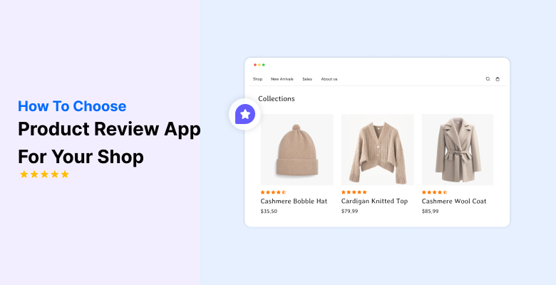
1. Make product pages instantly clear (Above the Fold)

Product pages must explain the offer in seconds. Buyers scan first. They decide before they scroll.
Above the fold should remove all confusion. The top section must show the product, the price, and the reason to buy.
When this area feels clear, users stay longer and click faster.
Focus on these elements above the fold:
- A clear product title that matches what buyers search for
- One main product image that shows the item clearly
- Visible price with no surprise details
- One primary add-to-cart button
- A short line that explains the main benefit
2. Structure product pages for decision-making
A good product page helps buyers make step-by-step decisions.
Start with the main benefit. Follow with key features. Then add details like size, material, or usage. Use short sections and clear headings so users can scan fast.
Avoid long blocks of text. Break information into simple points. When buyers find what they need without effort, they move closer to purchase.
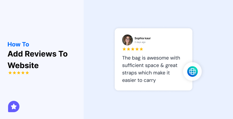
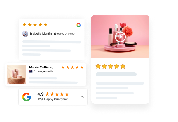
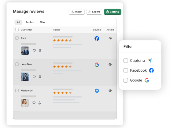
3. Use reviews and UGC as conversion drivers
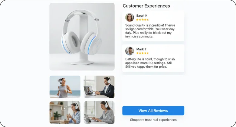
Reviews reduce doubt and build trust fast.
Shoppers trust real experiences more than product copy. Reviews and user photos help buyers imagine the product in real life.
Use reviews in these ways:
- Place star ratings near the product title or price
- Show short, clear customer comments
- Add customer photos or videos when possible
- Highlight reviews that mention common concerns
When buyers see proof from others, hesitation drops.
How WiserReview Helps Turn Reviews into Conversions
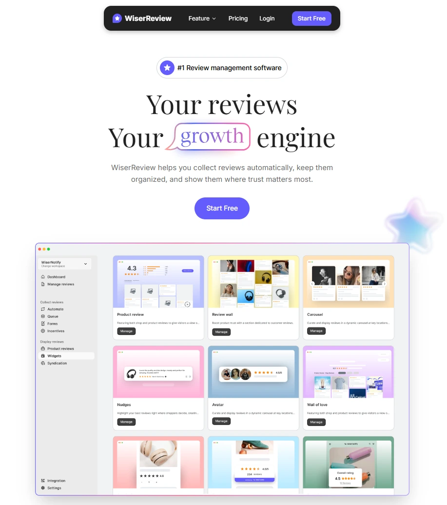
WiserReview is the best review management software. It helps ecommerce stores collect real customer reviews and show them where buyers look first. It focuses on making reviews visible, clear, and useful.
It focuses on real proof and easy setup. It avoids complex workflows and keeps everything simple for store owners.
Key WiserReview features include:
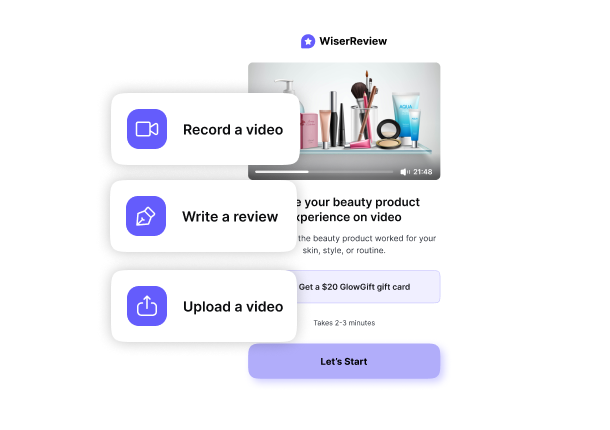
- Collects text, photo, and video reviews from real customers
- Sends review requests automatically after purchase
- Displays reviews near product titles, prices, and add-to-cart buttons
- Shows clean review widgets without slowing down pages
- Helps stores build trust without changing their design
All your reviews in one place
Collect reviews, manage every response, and display them where they matter most.
4. Eliminate information gaps
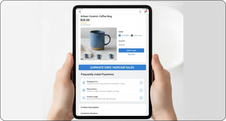
Missing information stops sales.
If buyers cannot find answers, they leave. Common gaps include shipping time, return policy, size details, and product usage. Fix these gaps before users ask.
Add short FAQs on product pages. Use clear labels and simple words. When buyers feel informed, they feel safe to buy.
Middle of funnel: Simplify the buying process
The middle of the funnel is where interest turns into intent.
At this stage, shoppers like your product. They compare options and check details. If the buying process feels slow or confusing, they hesitate. Your goal is to remove friction and keep momentum.
5. Make category pages shopping-focused
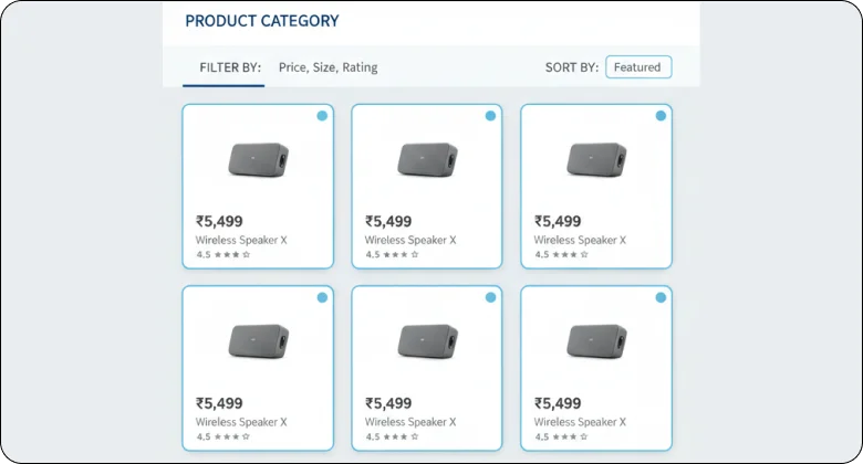
Category pages should help buyers find products fast.
Shoppers use these pages to compare options, not to read long content. If the layout feels busy or unclear, they lose interest. Your category pages should feel clean and predictable.
Start with a short intro if needed, then let products take focus. Keep filters simple and useful. Sorting should help buyers narrow choices, not confuse them.
Focus on what matters on category pages:
- Clear product images and prices
- Simple filters like price, size, or rating
- Consistent product cards across the page
When category pages feel easy to scan, buyers move forward faster.
6. Reduce friction in the cart
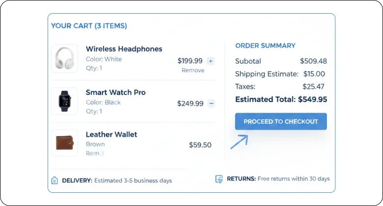
The cart should confirm choices, not create doubt.
At this stage, buyers are close to checkout. Any extra step or surprise can stop the sale. The cart must feel clear and safe.
Use short paragraphs to explain actions. Show what is in the cart and what comes next. Avoid distractions that pull users away.
Key things the cart should do well:
- Show product details clearly
- Allow easy quantity changes
- Display delivery or return info nearby
A clean cart keeps buyers confident.
7. Streamline checkout
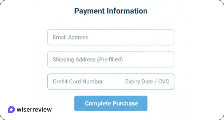
Checkout is the moment where intent turns into action. Buyers already trust the product. They only want to finish the purchase without friction. When checkout feels long or confusing, even serious buyers pause.
Keep checkout focused on one goal: payment. Remove forced account creation, extra fields, and unnecessary steps. Ask only for the information needed to deliver the order. Use clear labels and simple language so users know exactly what to do next.
8. Show total costs early
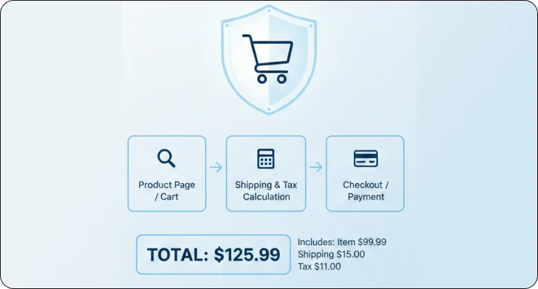
Price surprises stop purchases.
Buyers want to know the full cost before they invest more time. When shipping fees or taxes appear late, trust drops instantly. Even small extra charges can feel dishonest if they show up at the last step.
Show the full price early in the process. Make shipping costs, taxes, and totals easy to find and easy to understand. Update the total as buyers change options.
When pricing feels open and clear, buyers feel safe to continue and complete the purchase.

Turn real reviews into more sales
Collect, manage, and display customer reviews where buyers decide. Build trust and increase conversions without extra traffic.Psychological levers and on-site engagement
This stage is about helping buyers feel confident enough to act.
Shoppers often want to buy, but they hesitate. Doubt, fear of regret, or too many choices slow them down. Psychological cues help reduce this hesitation and keep users engaged on your site.
9. Use urgency and scarcity with integrity
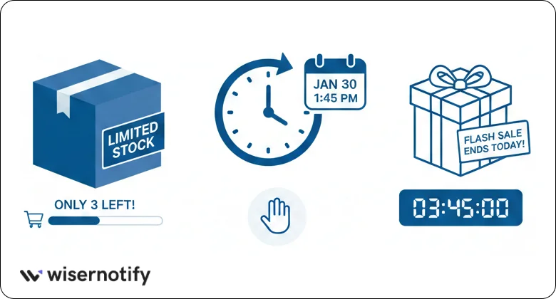
Urgency works when it feels honest.
Shoppers move faster when they believe they might miss out, but only if the signal is real. Fake countdowns or false stock limits damage trust and reduce repeat sales.
Use urgency to support real situations. Limited inventory, delivery cut-off times, or short-term offers help buyers decide without pressure. Keep the message simple and clear so users understand why they need to act now.
Urgency works best when:
- Stock is actually limited
- Offers have real end times
- Messages stay calm and factual
Wisernotify is the best social proof tool. It helps you show real-time actions like recent purchases, signups, and limited stock alerts. These signals are based on actual user behavior, not fake timers.
10. Deploy popups strategically

Popups should help, not interrupt.
Most shoppers leave when pop-ups appear too early or block content. Timing and purpose matter more than design. A pop-up should solve a problem, not demand attention.
Use popups after users show intent. This could be after scrolling, spending time on a page, or moving toward the exit. Keep the message short and focused.
Mobile optimization & SEO for conversion
Most ecommerce traffic comes from mobile. If your store feels slow or hard to use on a phone, sales drop fast.
11. Optimize for mobile first
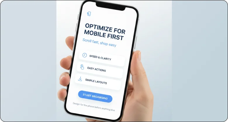
Most shoppers use their phones to browse and buy. They scroll fast and expect things to work without effort. If a page feels slow, crowded, or hard to tap, they leave.
Mobile-first means designing for the phone before anything else. Keep layouts simple. Make actions easy to reach with a thumb. Focus on speed and clarity so users can move without thinking.
Pay close attention to these mobile basics:
- Buttons that are large and easy to tap
- Text that is clear without zooming
- Images that load fast and fit the screen
- Forms that need less typing
When your store feels smooth on mobile, buyers stay longer and complete purchases.
12. Use SEO to attract higher-intent traffic
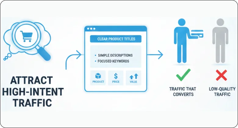
SEO brings people who are already looking for what you sell.
Not all traffic converts. Search traffic works best when pages match intent. Product and category pages should answer exactly what users search for, without extra noise.
Use clear product titles, simple descriptions, and focused keywords. Avoid long introductions that delay information. Help search visitors find the product, price, and value fast.
Turn real reviews into more sales
Collect, manage, and display customer reviews where buyers decide. Build trust and increase conversions without extra traffic.Continuous optimization & Long-term growth
Conversion rate optimization is not a one-time task. Stores change, buyers change, and what works today may not work next month.
13. Implement a CRO testing program
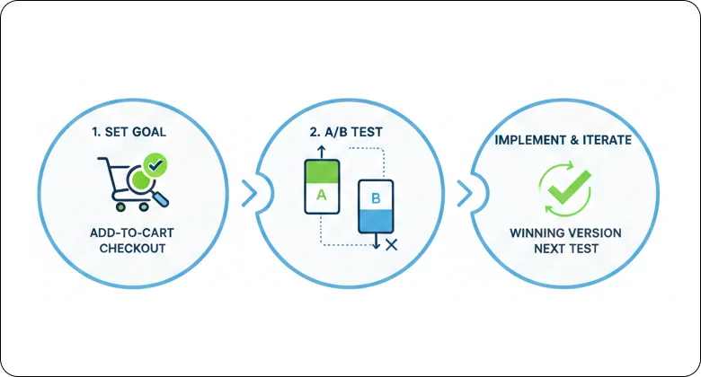
Conversion improvement works best when decisions are based on real data. A testing program helps you learn what actually improves results instead of relying on guesswork.
Start small and stay focused. Test one change at a time so results stay clear. This could be a headline, button text, layout change, or image swap. Give each test enough time to collect real data before making a decision.
A simple testing process includes:
- Choosing one goal, like add-to-cart or checkout completion
- Testing a single change against the current version
- Keeping the winning version and moving to the next test
14. Leverage post-purchase touchpoints
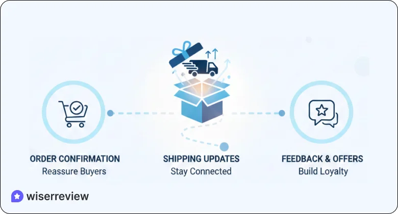
The sale is not the end of the customer journey. What happens after checkout shapes trust, repeat purchases, and reviews.
Use post-purchase messages to reassure buyers and stay connected. Order confirmations, shipping updates, and follow-up emails help customers feel confident about their decision. This is also the best time to ask for feedback or offer related products.
15. Analyze funnel drop-offs
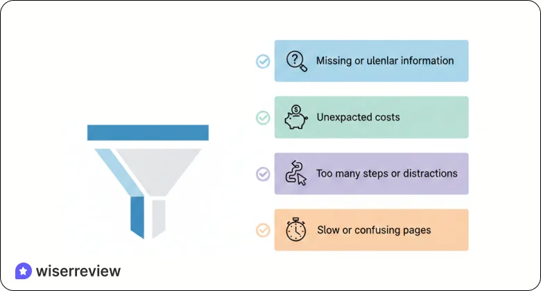
Funnel drop-offs show where buyers get stuck or lose interest. Each drop-off point points to a problem worth fixing.
Look at your funnel step by step. Check product pages, carts, and checkout. Focus on where users leave most often and what they see before exiting.
Common reasons buyers drop out:
- Missing or unclear information
- Unexpected costs
- Too many steps or distractions
- Slow or confusing pages
Turn real reviews into more sales
Collect, manage, and display customer reviews where buyers decide. Build trust and increase conversions without extra traffic.Wrap up
Ecommerce conversion rate optimization is about making buying easy.
Most conversion problems come from friction. Buyers leave when pages feel unclear, slow, or untrustworthy. The 15 tips in this guide focus on removing those problems across the entire buying journey.
You do not need to change everything at once. Start with clarity at the top of the funnel. Simplify the cart and checkout. Build trust with honest signals. Then test small changes over time.
When buying feels easy, people buy more. That is the result of strong conversion rate optimization.
Frequently asked questions
Ecommerce conversion rate optimization is the process of improving your store so that more visitors complete a purchase. It focuses on clarity, trust, speed, and ease of use across product pages, cart, and checkout.
It helps you increase sales without increasing traffic. Instead of spending more on ads, you improve the experience so existing visitors are more likely to buy.
Most conversions fail due to unclear product pages, missing information, slow load times, hidden costs, and complicated checkout steps. These issues create doubt and push buyers away.
Small changes can show results within days or weeks, especially on high-traffic pages. Long-term improvement comes from testing, tracking, and refining changes over time.
Yes. CRO is especially useful for small stores because it helps you get more value from limited traffic. Even simple fixes can lead to noticeable sales growth.
WiserReview helps ecommerce stores build trust where it matters most. It collects real customer reviews and displays them on product and key pages. When buyers see honest feedback from other customers, doubt drops, and purchase confidence increases.