PrestaShop checkout optimization helps customers complete orders faster.
If checkout is slow or complicated, customers leave. Extra fields, forced signup, and limited payment options reduce completed orders.
You need a simple and fast checkout. Remove unnecessary steps. Keep forms short. Offer clear payment options.
In this guide, you will learn how to optimize your PrestaShop checkout to increase conversions and reduce cart abandonment.
1. Enable Key Performance Settings
PrestaShop performance settings directly affect checkout speed. A slow checkout page increases cart abandonment. You need to improve the loading time first.
Turn On CSS/JS Smart Cache + Move JS to End (CCC Settings)
PrestaShop allows you to combine and compress CSS and JavaScript files. This setting reduces file size and lowers page load time.
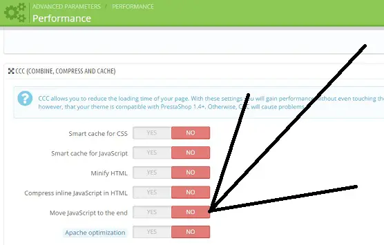
Go to Advanced Parameters → Performance.
Enable:
- Smart cache for CSS
- Smart cache for JavaScript
- Minify HTML
- Move JavaScript to the end
Moving JavaScript to the end prevents scripts from blocking the checkout page. The page loads first. Scripts load after. This makes checkout feel faster.

Best PrestaShop Product Reviews Module
Collect reviews, manage every response, and display them where they matter most.
Start Free →Enable High-Performance Cache System (Redis/APC)
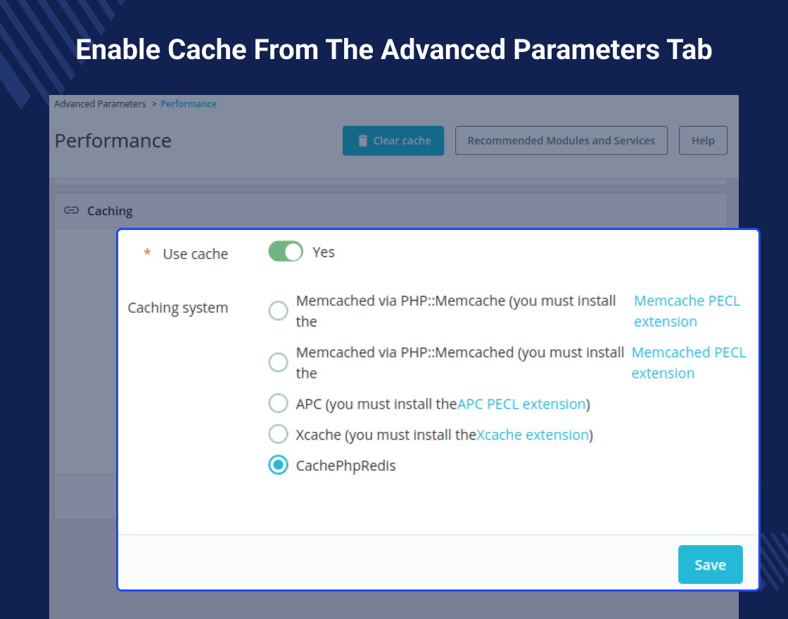
Caching reduces server load and improves response time.
In Advanced Parameters → Performance, enable caching and select a high-performance option like:
- Redis
- APC
Redis works well for larger stores with higher traffic. APC works well for smaller to medium-sized stores.
A strong cache system speeds up checkout pages. Faster response time leads to faster order completion.
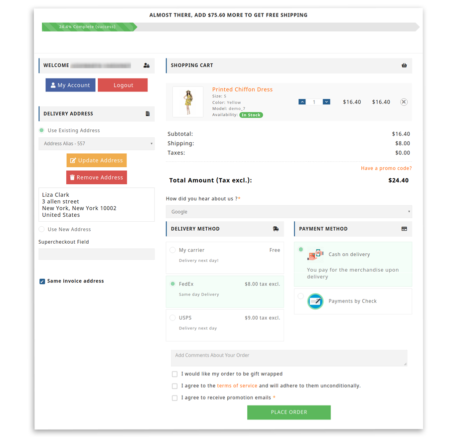
2. Switch to One-Page Checkout
One-page checkout reduces friction. Customers complete all steps on a single page rather than navigating multiple screens.
Replace Multi-Step Checkout with One-Page Checkout Module
Multi-step checkout increases drop-offs. Customers move between pages to enter shipping, billing, and payment details. Each step adds friction.
A one-page checkout keeps everything on a single screen. Customers fill in details, select shipping, choose payment, and review the order in one place. This reduces clicks and saves time.
Install a one-page checkout module in PrestaShop to replace the default multi-step flow. After installation, test the checkout on desktop and mobile to ensure smooth performance.
Choose a Proven One-Page Checkout Module
Do not install any random module. Choose a module with good reviews, regular updates, and strong support.
Before selecting a module, check:
- Compatibility with your PrestaShop version
- Mobile responsiveness
- Payment gateway compatibility
- Speed performance
- Clean and simple layout
A stable one-page checkout module reduces friction. Less friction leads to faster orders and higher conversions.
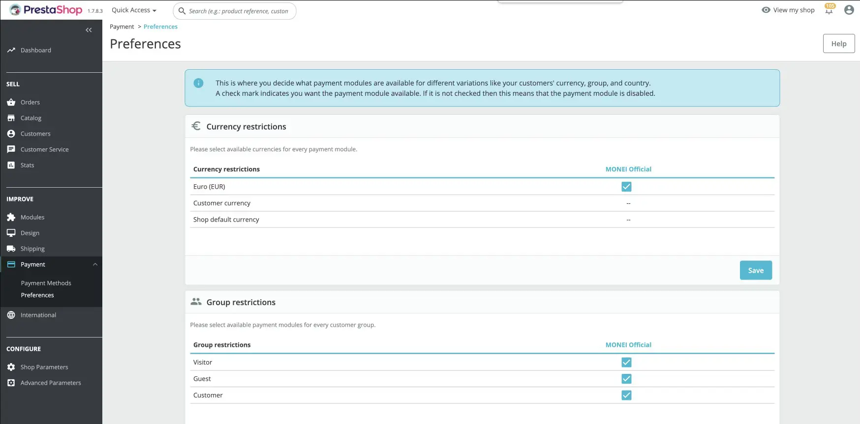
3. Reduce Required Form Fields
Too many form fields slow down checkout. Customers do not want to fill out long forms. Every extra field increases the chance of cart abandonment.
Delete Non-Essential Address Fields
Extra address fields slow down checkout. Customers do not want to fill in information that is not required for delivery.
Remove fields like:
- Company name
- Address line 2
- Fax number
- Title or gender
- Date of birth
Keep only what is needed to ship the order and contact the customer. A shorter form reduces typing time and lowers errors.
You can adjust required fields from Customer Settings or use a checkout module to hide unnecessary fields.
Enable Guest Checkout
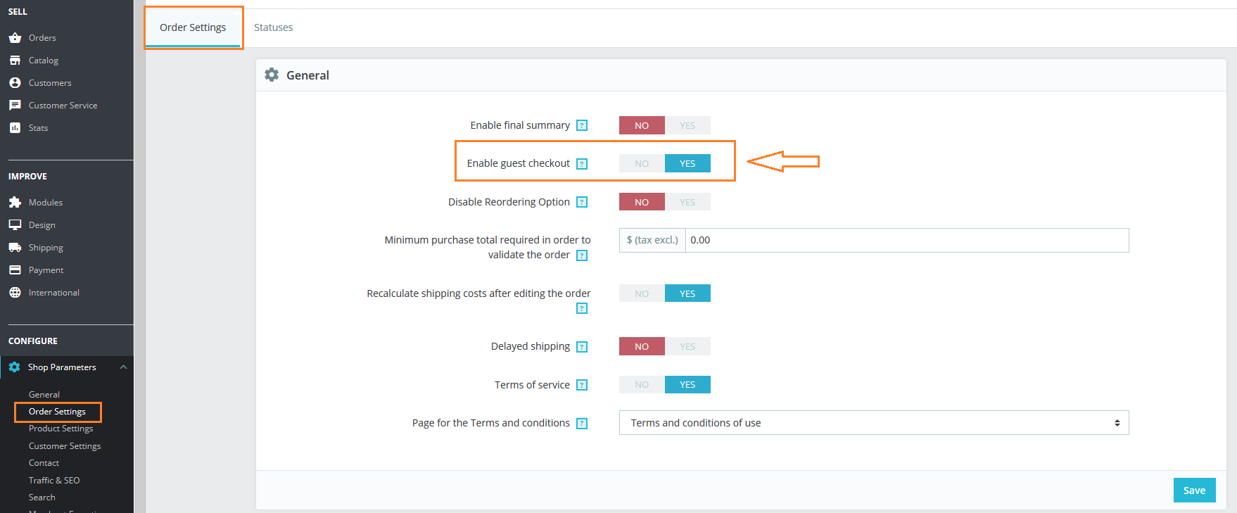
Forced account creation increases cart abandonment. Many customers want to buy quickly without creating an account.
Enable guest checkout in your PrestaShop settings. Allow customers to place orders using only their email and shipping details.
You can still offer account creation after the purchase. This keeps checkout fast while giving customers the option to register later.
Fewer fields and no forced signup lead to faster orders and higher conversions.
Best PrestaShop Product Reviews Module
Collect reviews, manage every response, and display them where they matter most.
Start Free →4. Optimize Payment Flow to Avoid Slow Redirects
Payment is the final step in checkout. If this step feels slow or confusing, customers leave.
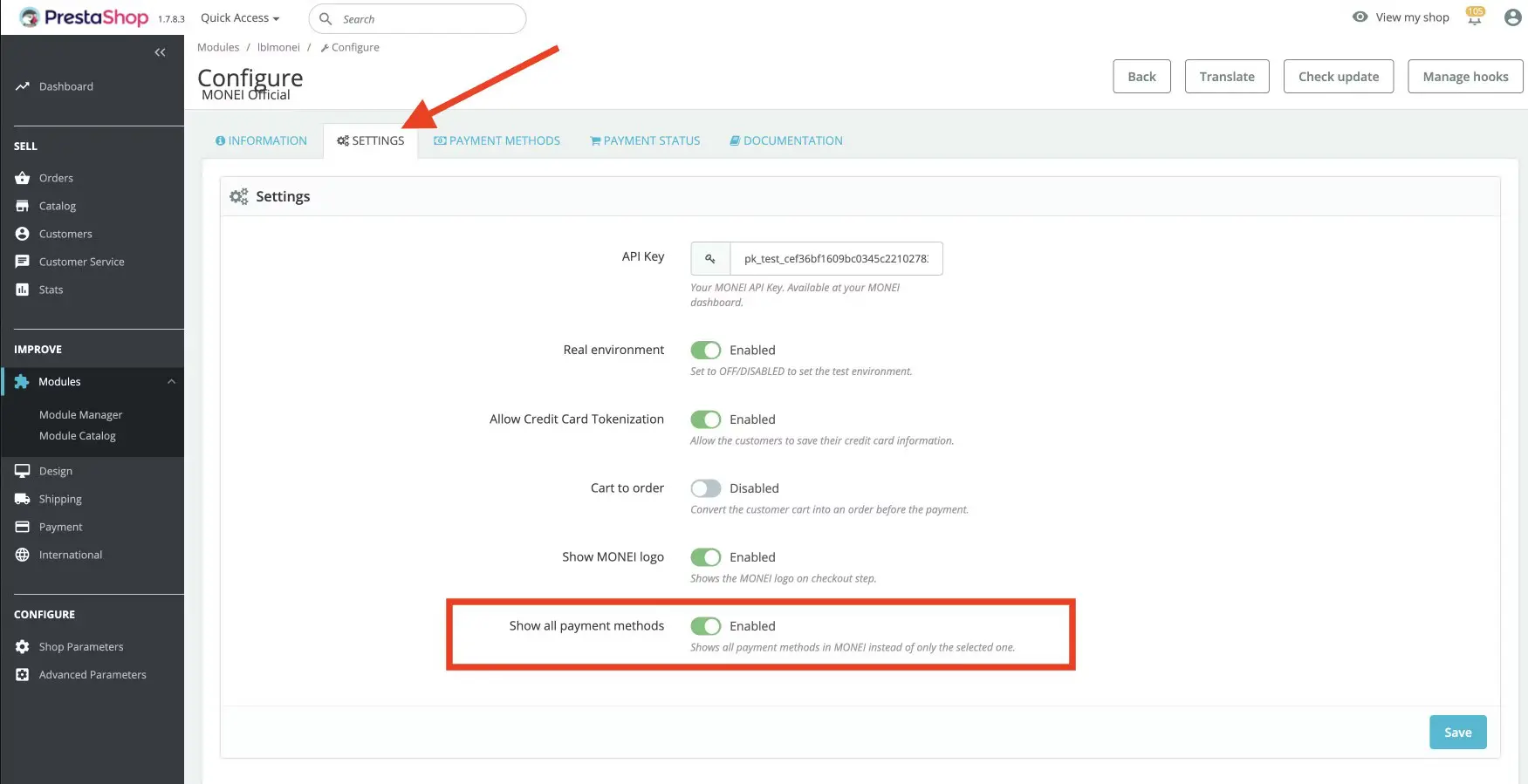
Use Embedded/On-Page Payment Instead of Redirects
Redirecting customers to another website during payment slows down checkout. It also creates doubt. Some customers think the process failed and leave.
Use embedded or on-page payment methods. These allow customers to enter card details directly on your checkout page. The order completes without leaving your store.
On-page payments reduce loading time and keep the experience smooth. A smooth payment process increases completed orders.
Offer Multiple Popular Payment Methods
Customers prefer different payment options. If their preferred method is missing, they may abandon the cart.
Offer common payment methods such as:
- Credit and debit cards
- PayPal
- Bank transfer
- Buy Now, Pay Later options (if relevant)
Show payment options clearly during checkout. Do not overload the page with too many methods. Offer the most trusted and widely used options for your audience.
More convenient payment choices lead to faster decisions and fewer abandoned orders.
5. Fix Mobile Checkout
Most customers shop on mobile devices. If your mobile checkout is slow or hard to use, you lose orders.
Improve Tap Targets & Vertical Layout on Mobile
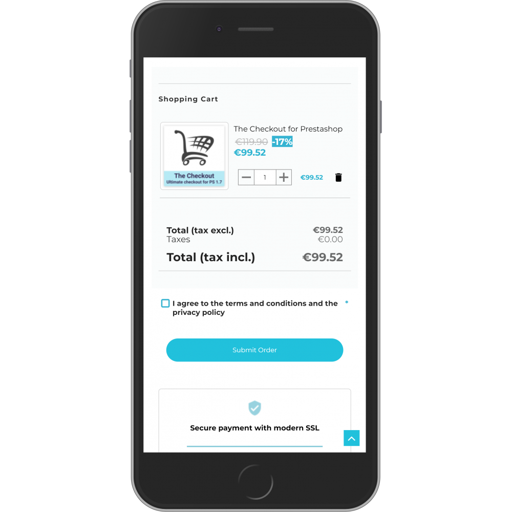
Mobile users tap with their fingers. Small buttons and tight spacing create mistakes. Customers tap the wrong field or struggle to click the payment button.
Make buttons large and easy to tap. Add space between form fields. Keep the “Place Order” button clear and visible. Do not place small links near important buttons.
Use a simple vertical layout. Show fields one below another. Do not place multiple fields in one row. A single-column layout makes scrolling smooth and natural.
Place labels above input fields. Do not hide labels inside the box. Clear labels help customers fill forms correctly.
Remove extra banners or popups from checkout. Keep the page focused only on completing the order.
Simple layout leads to faster checkout.
Add Google Places Address Autofill
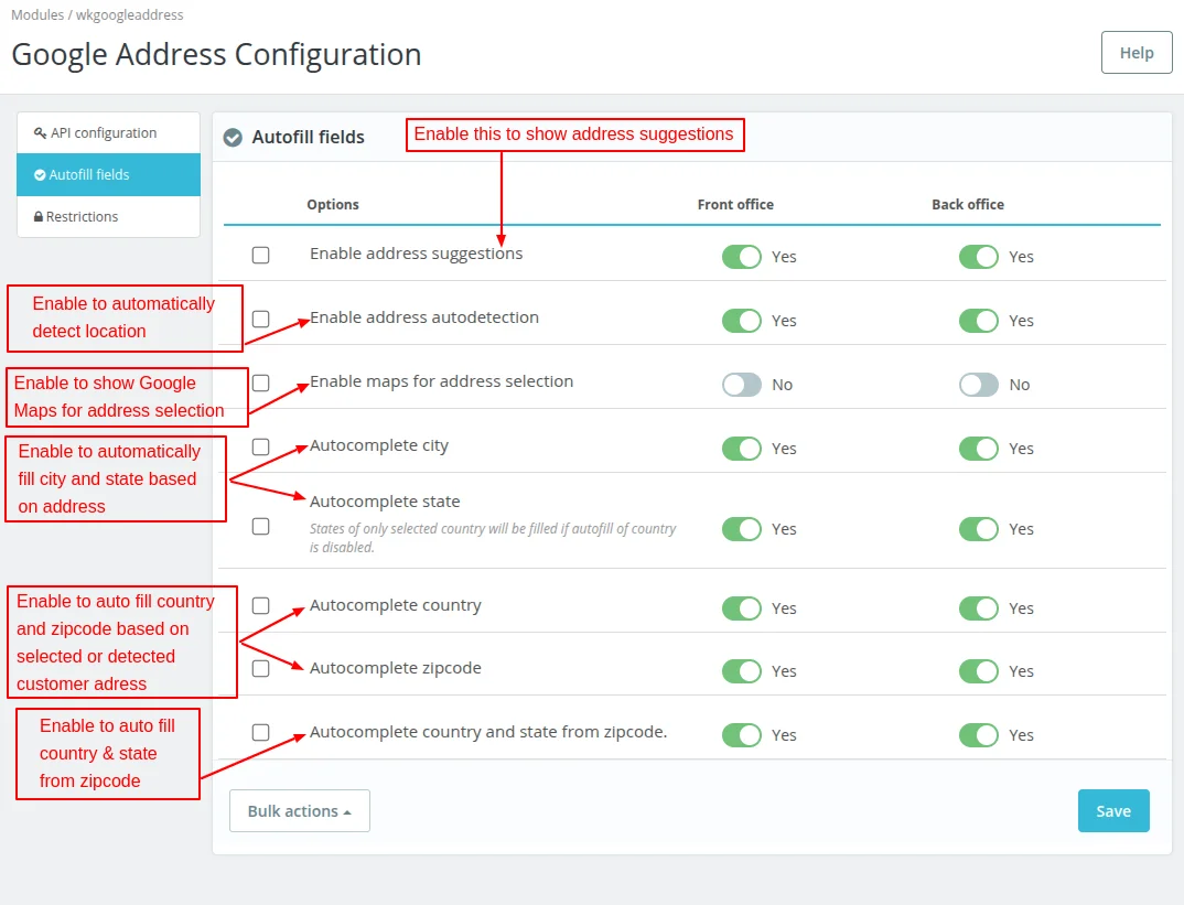
Typing a full address on a mobile takes time. Manual entry increases errors.
Add Google Places address autofill to your checkout. When customers start typing, the system suggests full addresses. Customers select the correct one instead of typing everything.
This reduces typing effort and prevents delivery mistakes. Faster address entry leads to faster order completion.
6. Add Essential Trust Elements Near the Payment Button
Customers think carefully before they click the final payment button. This is the moment where they share card details and confirm the order. If they feel unsure, they leave.
Show Security & Reassurance Signals
Customers want to feel safe before they complete payment. If the page looks uncertain, they hesitate.
Show a small “Secure Checkout” message near the payment button. Display SSL security icons and trusted payment logos such as Visa, Mastercard, or PayPal. These symbols make the checkout feel reliable.
Add a short reassurance line like “Your payment information is encrypted” or “Safe and secure payment.” Keep it simple and clear.
You can also show basic return information, such as “Easy returns” or “Money-back guarantee.” This reduces fear at the final step.
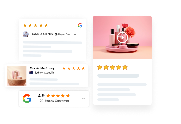
Show Reviews and Testimonials
Social proof builds confidence. When customers see that others have purchased and shared positive feedback, they feel more comfortable placing an order.
Display star ratings or a short customer testimonial near the order summary. Keep it small and clean so it does not distract from the payment button.
You can also show the number of satisfied customers or verified buyer badges. This reminds shoppers that your store is trusted.
Clear security signals and visible reviews help customers feel confident. Confident customers complete their orders.
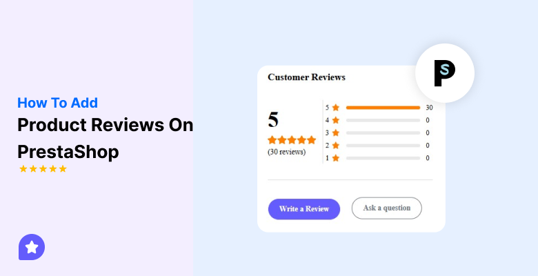
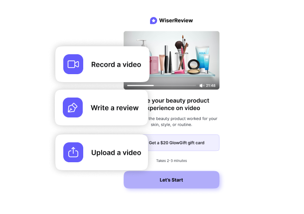
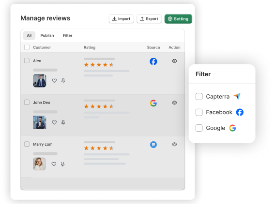
WiserReview is a product review tool for ecommerce stores. It helps you collect, manage, and display customer reviews in a simple way. You can collect star ratings, text reviews, photo reviews, and video reviews after each purchase. The system sends review requests automatically. You can control and publish reviews from one dashboard. WiserReview helps build trust and improve conversions by showing real customer feedback on your store.
7. Recover Abandoned Carts Automatically
Many customers add products to the cart but do not complete the order. This is normal in ecommerce. You should not ignore these lost sales.
Enable 1–2 Hour Recovery Email or SMS
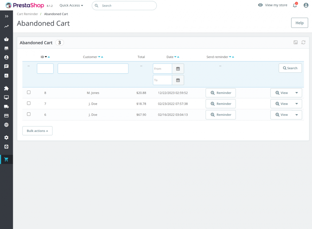
Many customers leave during checkout because they get distracted. A quick reminder can bring them back.
Set up an automatic recovery email or SMS that sends within 1 to 2 hours after cart abandonment. This is the best time to reconnect while the product is still fresh in their mind.
Keep the message short and clear. Remind them about the items in their cart. Add a direct link that takes them back to checkout. Do not add too much text.
You can test both email and SMS. SMS often gets faster attention, but use it carefully and only if the customer has agreed to receive messages.
A fast reminder increases the chance of recovery. Quick follow-up leads to more completed orders.
WiserReview sends automatic review reminder emails and SMS with custom timing settings to help bring customers back and complete their purchase.
All your reviews in one place
Collect reviews, manage every response, and display them where they matter most.
Conclusion
A fast checkout increases orders. A slow checkout loses sales.
You need to remove friction at every step. Improve speed settings. Use one-page checkout. Keep forms short. Allow guest checkout. Use fast payment methods. Fix mobile layout. Add trust signals. Recover abandoned carts.
Each change reduces drop-offs.
When checkout feels simple and quick, customers complete the order without hesitation.
Frequently asked questions
Slow hosting, too many modules, heavy scripts, and redirect-based payments often cause delays.
Yes. One-page checkout reduces steps and keeps the process simple, which lowers cart abandonment.
Yes. Guest checkout removes friction and helps customers place orders faster.
Improve page speed, shorten forms, fix mobile layout, and send automatic cart recovery emails.
Yes. Most customers shop on mobile. A slow or difficult mobile checkout reduces completed orders.
WiserReview displays verified customer reviews and star ratings near the checkout area, which builds trust and helps customers complete their orders with confidence.